Greetings readers,
There’s been some buzz recently about how friendly Substack’s newsletter functionality is for writers and readers, so I thought I’d give it a try and see how it goes. Please feel free to leave feedback—I’d love to hear your thoughts.
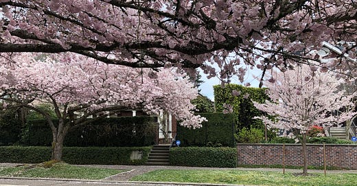
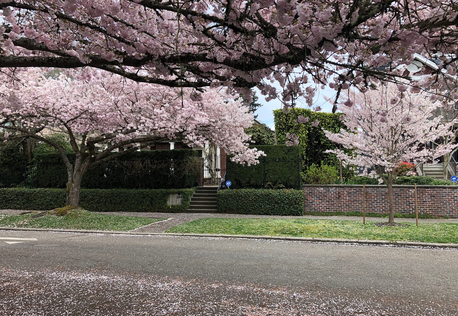
I spent much of April thinking about color. Seattle is a vibrant city and in Spring it is filled with flowers of all kinds. My favorites might be the cherry blossoms, exploding in front of gorgeous turn-of-the-century buildings and the occasional vape shop.
According to this article by Nick Hobson, New AI Research Shows That Our World is Becoming More Boring and Less Colorful, color is becoming rarer in modern life. AI determined that roughly 60% of the objects, items, and materials available today are manufactured in white, gray, or black. While cherry blossoms might be bright pink, the cars driving beneath them are far less likely to sport exciting pigments. Scrolling through Zillow, it’s hard not to notice how many interiors are gray, gray, gray, with maybe a pinch of white.
Gwyneth Paltrow certainly leaned into the vibe with her “stealth luxury” ski trial outfits. While she looks great, there’s not a teal, red, or purple in sight. In the fashion of the super wealthy (I’m basing this observation on Succession, so take it with a grain of salt), color is a double-bladed sword that must be wielded only occasionally and with discretion.
On Instagram, poet and speaker Alok recently shared a summary of the book Chromophobia by David Batchelor. The post argues on behalf of color, touching on the ways Western culture tends to associate desaturation with luxury and refinement.
While sometimes a movie or tv show will embrace riotous color, often they seem dimly lit and limited to a narrow range of shades. This tweet references the Technicolor films of the last century. Remember The Red Shoes or Singing in the Rain? The exciting Technicolor process made remarkable things possible for a brief period in film history. It’s great when a film like 2022’s Pearl makes an effort to replicate that impact.
Personally, I don’t believe we’re going to continue the shift into desaturation. Maybe we’ll swing in the other direction, embracing crimson, emerald, and cerulean. Refinement and luxury are whatever, but curiosity, creativity, and fun are better.
Thanks for reading! I hope you have a great weekend. :)
~Sarah
Recommendation Corner
(not sponsored)
Chapbook: If you’re as into fairy tales as I am, I recommend checking out Girl / Mirror / Wolf, a collection of poems written by Katy Naylor and published by Bullshit Lit Mag + Press. Naylor’s words are carefully chosen for maximum impact and she definitely knows how to use color to great effect.
Book: While dated in places, Observatory Mansions by writer Edward Carey remains completely unforgettable. It brings the reader on a fascinating journey with a strange and inexplicable character. If you enjoy John Fowles, this book is definitely for you.
Color: Mint! This summer will be all about mint. Think the bright green of mint chocolate chip ice cream.
Stuff I Wrote
(ungated links)
Injecting More Razzle Dazzle into War Movies
Here’s a post I wrote after watching a brilliant war movie that I didn’t want to watch. If you ask me, these types of films could stand to dial down the grimness. Instead of bleak scenes where people get their legs painfully amputated on the battlefield, directors could consider adding some time steps or jazz hands. Or, maybe a musical number about battle wounds. Wouldn’t that be better?


I think a nice photo of cherry blossoms would have improved this luxurious, mostly black & white newsletter. 😉🍒
Yes, we need more color! After many years of wearing black and avoiding color I’ve found myself craving it. It also helps that I now live in New Mexico where colors range from vibrant turquoise to adobe clay to purple sunsets.